In this blog post, I will be looking at 3 crowdfunding projects that share the theme of mental health and analysing them in terms of structure, the effectiveness of communication and incentive to donate to these projects.
Yapa™
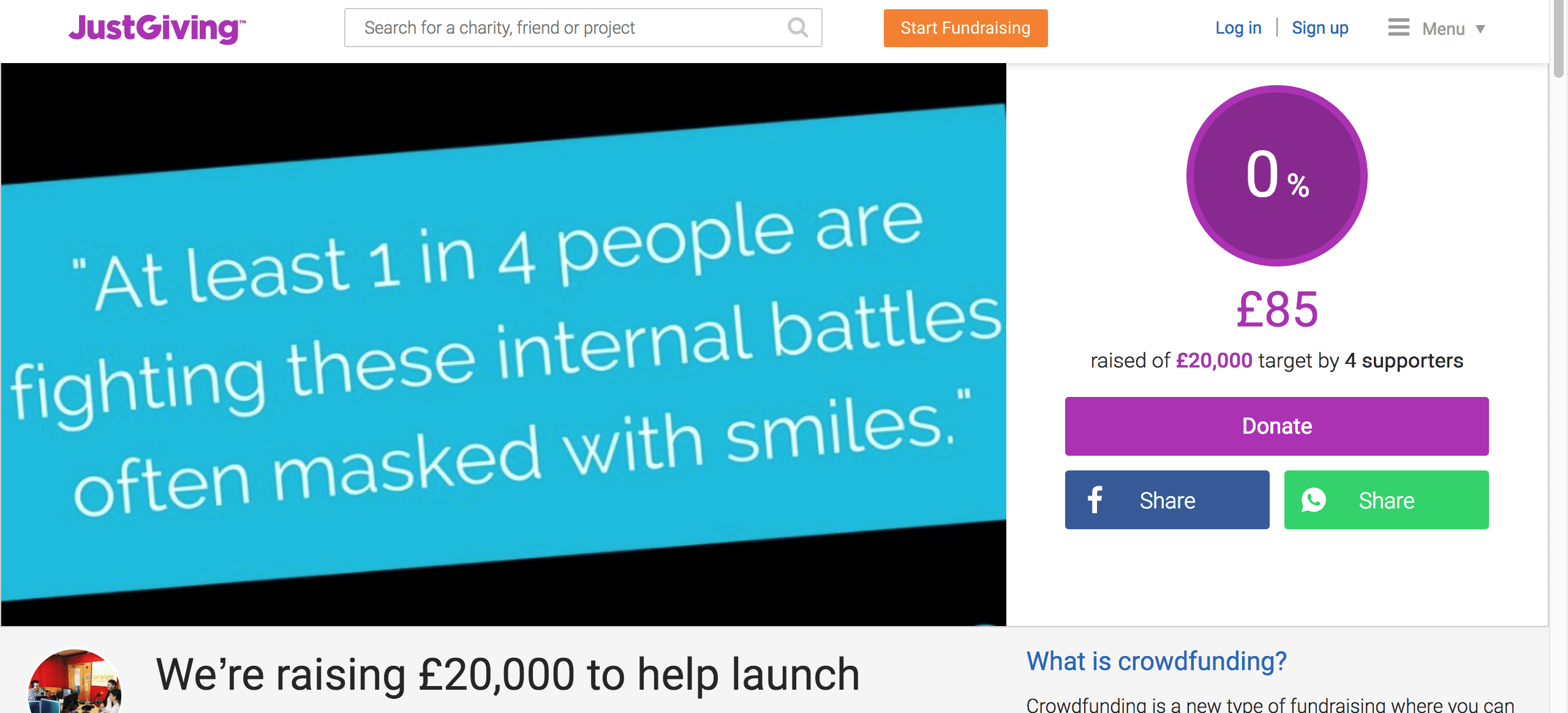
Yapa is a social app set to help people with their mental health that is being crowdfunded through the website justgiving.com. This app shares a lot of common elements with my project in regards to the mobile application format and mental health, however, this app is more general as opposed to my app which is specific for University students.
The structure of the page is segmented into groups with each one explaining a different aspect of the team, their goals and facts and figures to back up their claims. The opening segment is a brief overview of the app, using a little humour to catch the attention of the reader. The next section is about the team and how they are qualified and their past achievement. This is to show the reader that the creators are accomplished and are the right people for the job as it were and it gives the reader some insight to them allowing them to connect to them on a personal level, however, this example is more professional than personal. The next section presents some hard-hitting facts about the mental well-being of men. These facts are to elicit shock and make the reader more compassionate to their cause. The last sections are a timeline of production and the charities they are associated.
From this example, I can see that using a little humour and facts can communicate a message very effectively which can be important when talking about a sensitive topic. I will take this into consideration when I outline my own crowdfunding page.
EVA: The Mental Healthcare Smartphone App
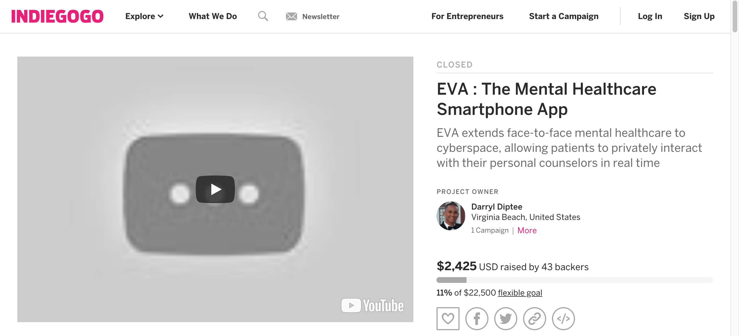
This crowdfunding project on indiegogo.com is called EVA extends face-to-face mental health care to cyberspace, allowing patients to privately interact with their personal counsellors in real time. This page shares the common element from the previous example that it separated into sections but these ones are more specific with sections called “The Problem” and “The Solution” which outlines the issues this application intends to solve and how the app will accomplish that. The page also outlines how this app will work and how the money raised will be spent. These elements are very important as potential patrons will want to know how the money they donate is being used. A new feature in this page is the uses of reward tiers, with different donation amounts earning different perks or items which in this case ranges from a picture of the donator holding a sign will be included in the app itself to a signed photo journal. I will want to use this on my page as it gives more incentive to donate and it rewards them as well.
Master Mental Health Mobile App
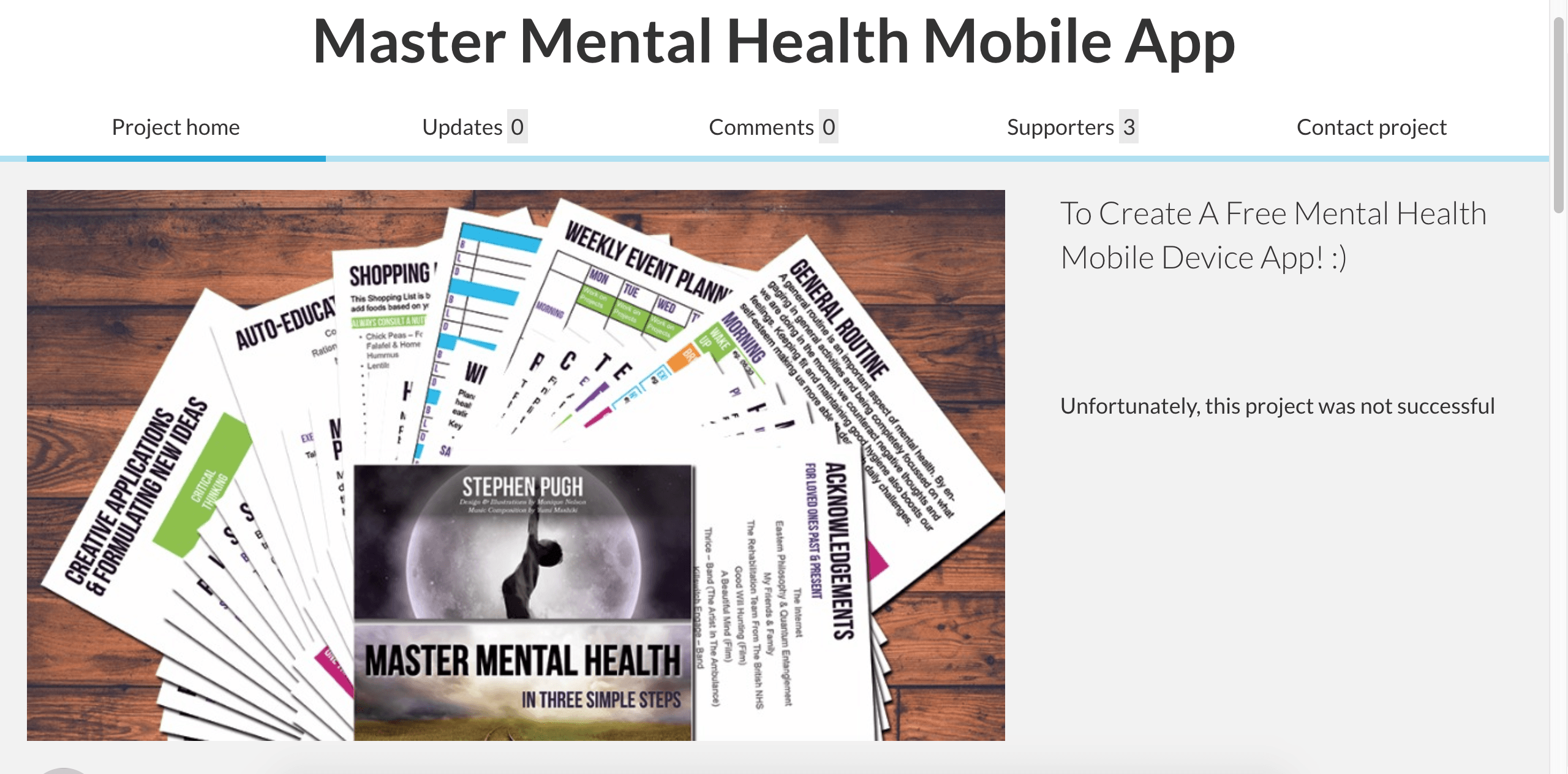
This crowdfunding project was hosted on the website “Crowdfunder” and it was not successful. The reasons for this could be the lack of organised information as the text is not formatted and is written in an informal manner with the use of text emoticons. This highlights the importance of clearly outlined out sections with clear, formal and engaging descriptions. The reward tiers are also considered to be impractical and it does not appeal to potential donators with writing such as “An Absolutley Enormous Thank You! 😀 A Virtual Hug & Kiss Mwah!!! :D”.
Using these three examples I will now give a brief outline of my crowdfunding page for this project. I will start with a brief introduction to the app and what its purpose. This will be written with a catchy tagline to catch the reader’s attention and will only use minimum details. This will be followed by some facts and statistics that I have collected during my research in order to show the importance of the issue that the app is tackling. The main fact I will use is the 1 in 4 students are suffering from their mental health as is clearly demonstrates the severity of the issue. I will then demonstrate how the money will be used and reward tiers available which will be in the form of mugs and t-shirts as these items can be charged for more money and will have some use to the donator. I will like to include a short 30-second animation highlighting the 1 in 4 facts which will be placed at the top of the page so it the first thing the reader will see. According to my research of other crowdfunding projects, this will be the most effective way if written in a professional and engaging way.
In conclusion, I have set an outline to my crowdfunding page based on research of other pages. In the next post, I will discuss the visualisation presentation method I will be using within my application as well as some wireframe of potential beta designs.